The first thing for any shop owner who is interested in making a profit is getting customers to walk in the door. The second is getting them to stay long enough to make a sale, whether you’re in hospitality, beauty or retail. This is where many people underestimate the power of a well-designed space. A beautiful interior and exterior could mean the difference between a sale and the retreating back of customer.
Design expert, Ken Nisch believes in the success of mall designs that allow customers to circulate the store, “…tempting those who want to wander around, but allowing line-of-sight for those who want to find something specific”.
Want your shop to pack a visual punch? Consider incorporating some of these cutting edge ideas into your designs:
Work with light and space

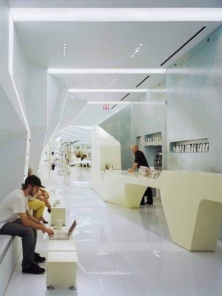
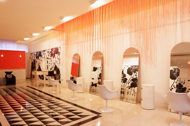
Natural light has been shown to combat depression, boosting happiness levels for both customers and employees. Studies have also shown that people in a room with a higher ceiling noticed more of the products on display. Can’t afford to extend your ceiling or pay for the additional floor space? There are a few tricks you can use to fool the eye into thinking a space is bigger than it actually is. This may include incorporating mirrors into the decor or using ceiling to floor wall hangings to create the illusion of height.
Mix materials, add vintage pieces

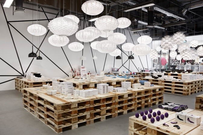
Retail spaces that combine materials which are not traditionally found together – wood and stone, metal and marble – can spark regular jolts of interest and curiosity so that the customer unwittingly ends up staying longer. Ironically, opting for futuristic or ultra-modern decor is more liable to age your establishment, as these styles go out of date quickly and are more than likely to be labelled ‘old’ rather than ‘classic’.
Adding personal touches here and there will stick in the minds of customers who are used to the more generic interior experience of other stores.
Customers are compelled to hang around when looking at designs that are memorable so don’t think twice about investing in unique pieces like light fixtures, furniture or art to keep them there. Just be sure to invest in an insurance policy that will cover your expensive investments in the event of an accident, like the customizable policy AXA offers beauty salons and hairdressers.
Use ‘In situ’ designs

Wallpaper and key décor pieces that go even further to visually transport a customer walking through the door, taking them out of the mundane daily bustle, adds a unique dimension to the shopping experience that will make them want to stay. A café with a complete Parisian theme or like this DIGEL Move men’s store that includes elements of male life all around the store are good examples. They also use a cityscape wallpaper to build the illusion of being in a high power meeting when trying on suits.


Add Comment